apartment alerts web app
My process
Research
Our initial problem:
More and more people living in Seattle are being forced to move out of the city due to increased housing costs.
Research question:
How might a solution be designed to help reduce this problem?
I set about researching this problem by doing competitive research and industry analysis. I then interviewed tenants, landlords, & other stakeholders in the low income housing world.
Compile research and analyze
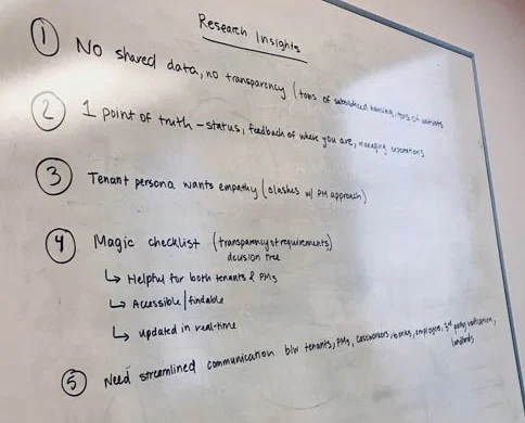
Problem: It became clear that the original problem was too broad in scope. The good news was that we identified a need that we could address.
Solution: Instead of trying to attack the overly broad problem of high cost of homeownership and renting in the Seattle area and the lack of availability of affordable housing, a problem that could be solved was the problem of prequalifying then connecting low income people to available affordable housing.
With the new problem scoped, to "How might low income people be connected to available housing?" I set about solving that problem with further interviews and research into the world of low income housing vouchers, and the technology and services available to low income people.
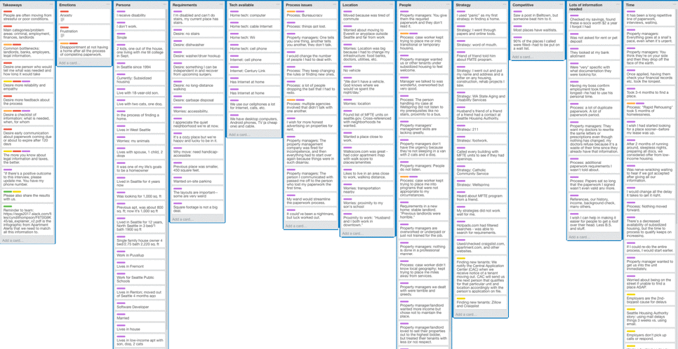
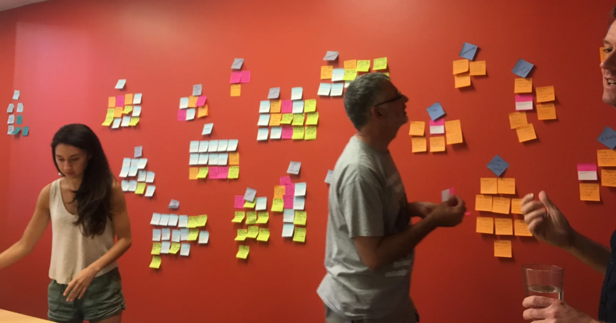
Affininty diagrams
Results of the research was then compiled and affinity diagrams were created to find patterns and themes. This lead to the scoping of the project.
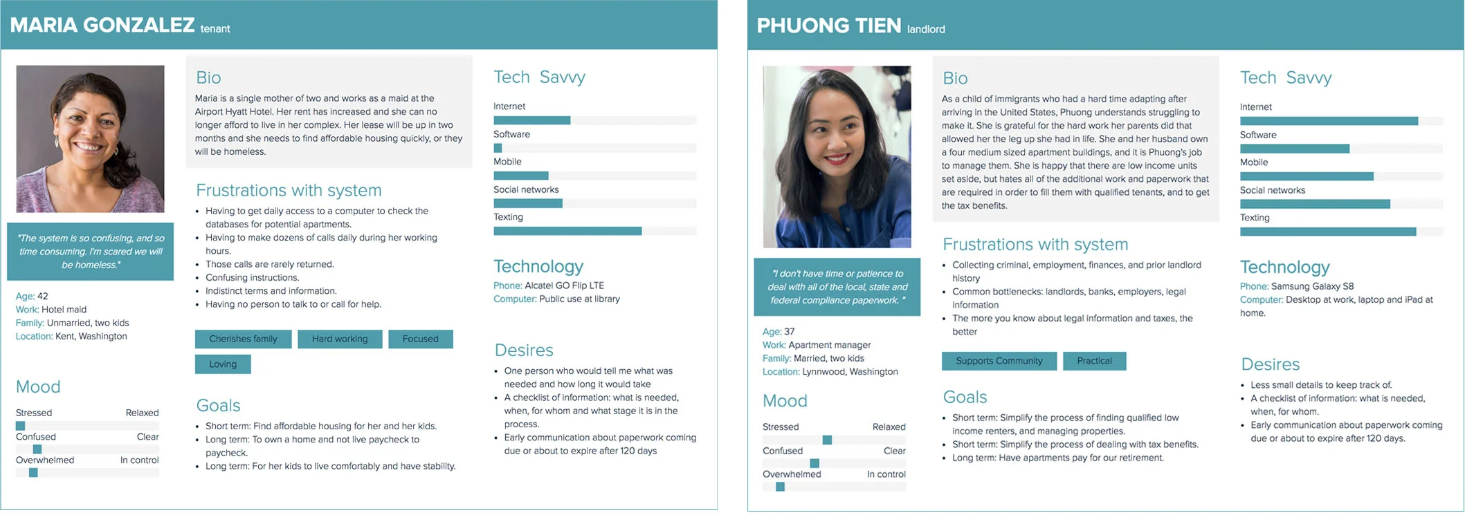
Personas
The data was used to create personas for both landlord and tenant.
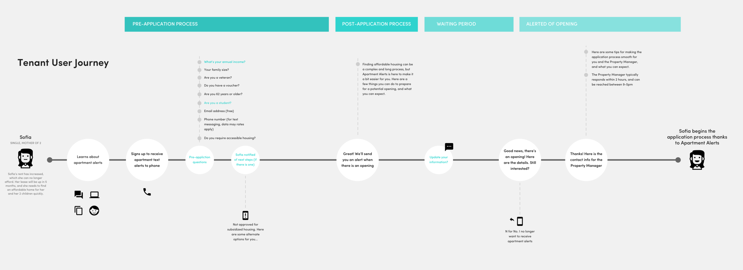
User journey
A user journey was created to define the who and why, and to offer insight into all of the touchpoints of the user’s journey.
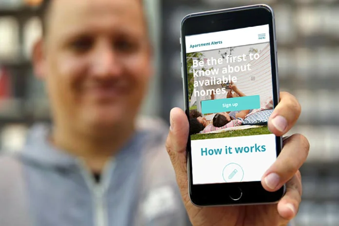
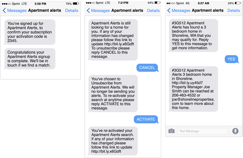
Text alerts
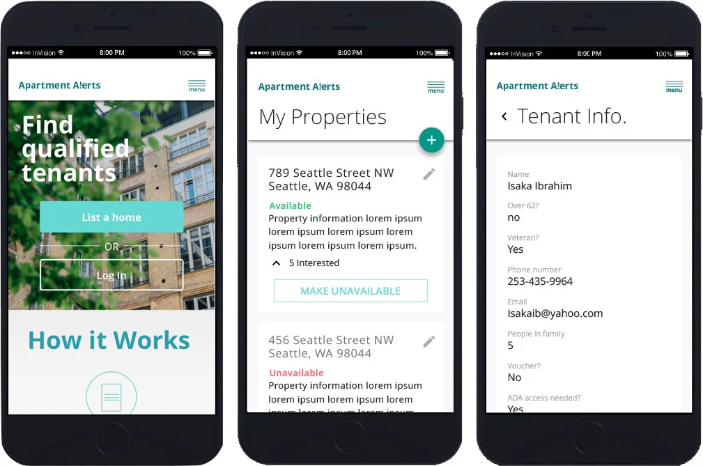
Problem: Research had shown that a large percentage of tenants did not have smartphones or reliable access to a computer. Solution: Communication with them would have to be entirely in text after their initial sign up.
Brainstorming
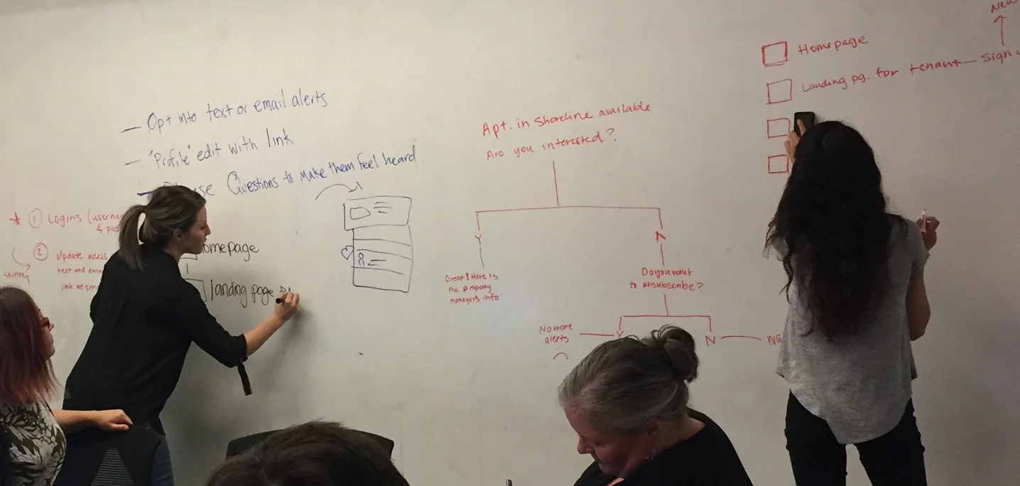
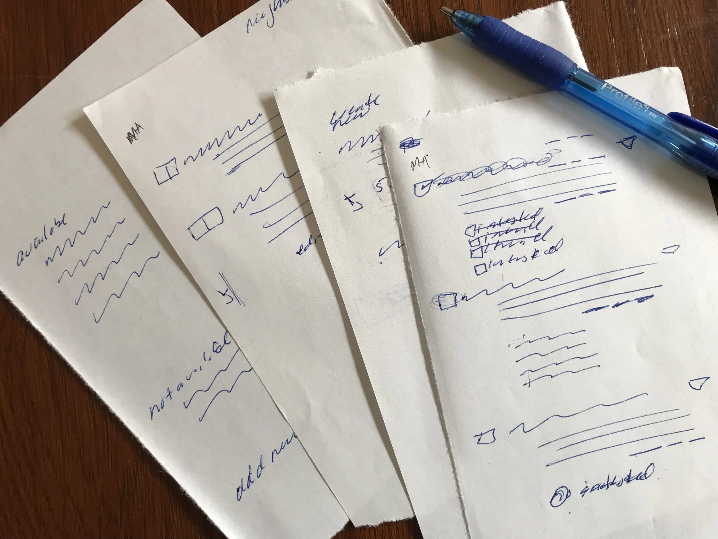
Next, the team started mapping out information architecture and started whiteboarding flows and wireframing.
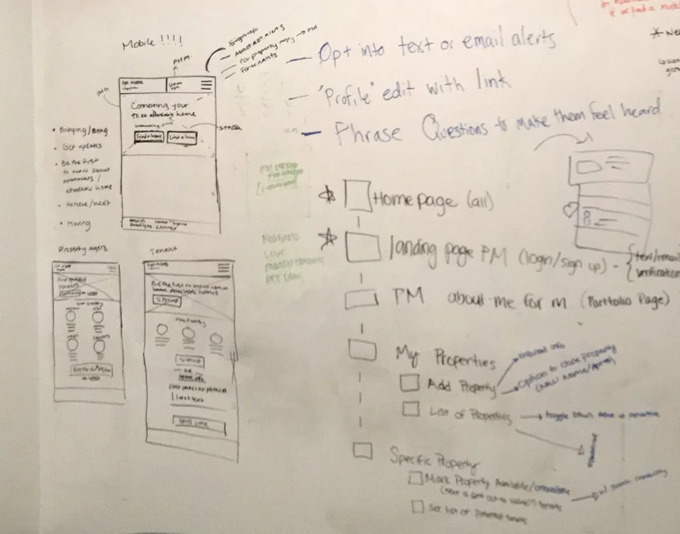
sketching
Whiteboard wire framing moved to slightly higher fidelity pen and paper sketching before heading to the computer.
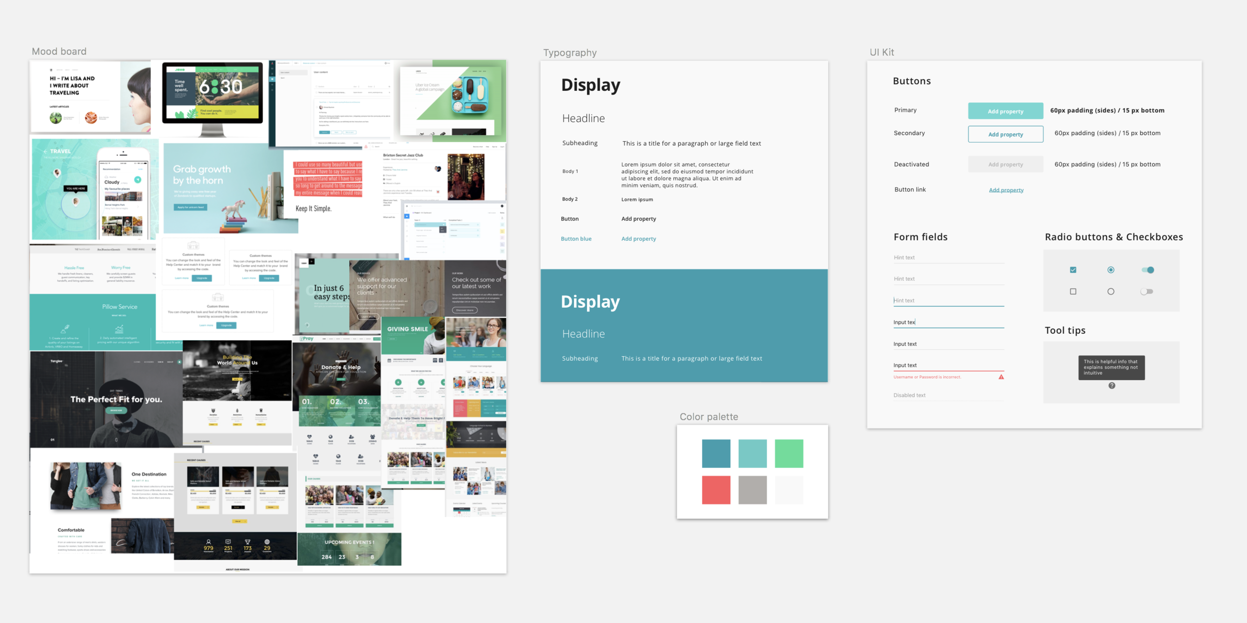
Visual design Mood board and style guide
Next came a mood board for visual design followed by a visual style guide.
Prototype
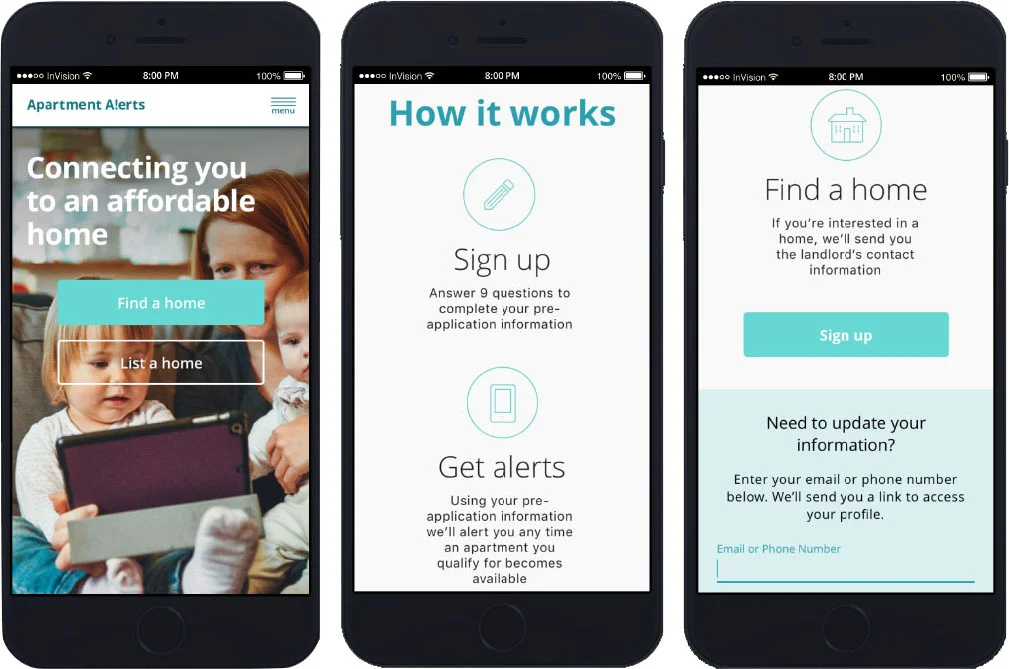
I then worked on creating a prototype to demonstrate the concept to put in front of users for usability testing, and further iterations.
Separate paths through the responsive website were created for the landlord and the tenant. Tenants would sign up and get qualified. Landlords would be able to manage property availabilities and the tenants who were prequalified and interested in renting. This solution addressed key pain points for both groups.
Sample screens from the tenant path:
Sample screens from the landlord path:
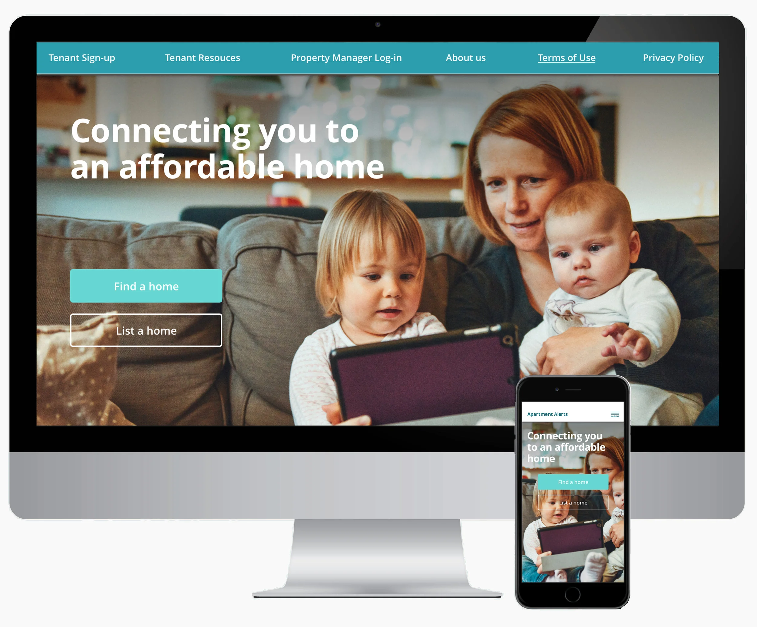
Create Responsive
Since this was created as mobile first, I then went back and designed the desktop experience. I opted not to do a tablet version because research showed that tablets were not a modality of our target audience.
My Role:
User research
User flows
Wireframing
Prototyping
Visual design
The Problem:
Families who qualify for low income housing have a hard time finding appropriate housing. Landlords with low income housing have a hard time finding income and demographic qualified tenants.
The Solution:
A web app that alerts prequalified tenants when an apartment becomes available that fits their needs, then provides landlords a list of qualified and interested tenants.