Wine palate app
Home screen
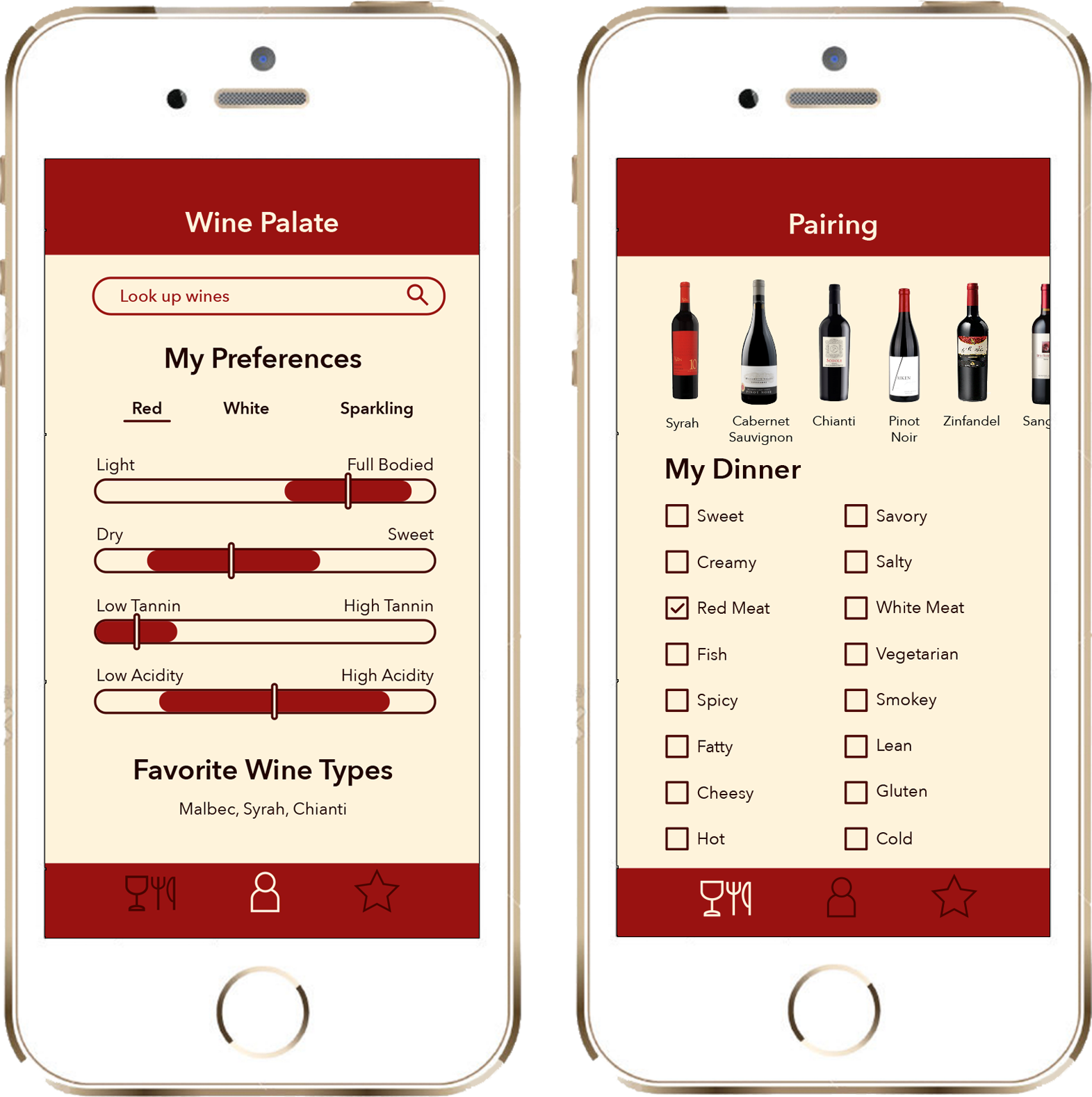
When the repeat user launches the app, their home screen shows a visual summary of the characteristics of their wine preferences in the categories of red, white, and sparkling. This profile will change in time as they review more wines.
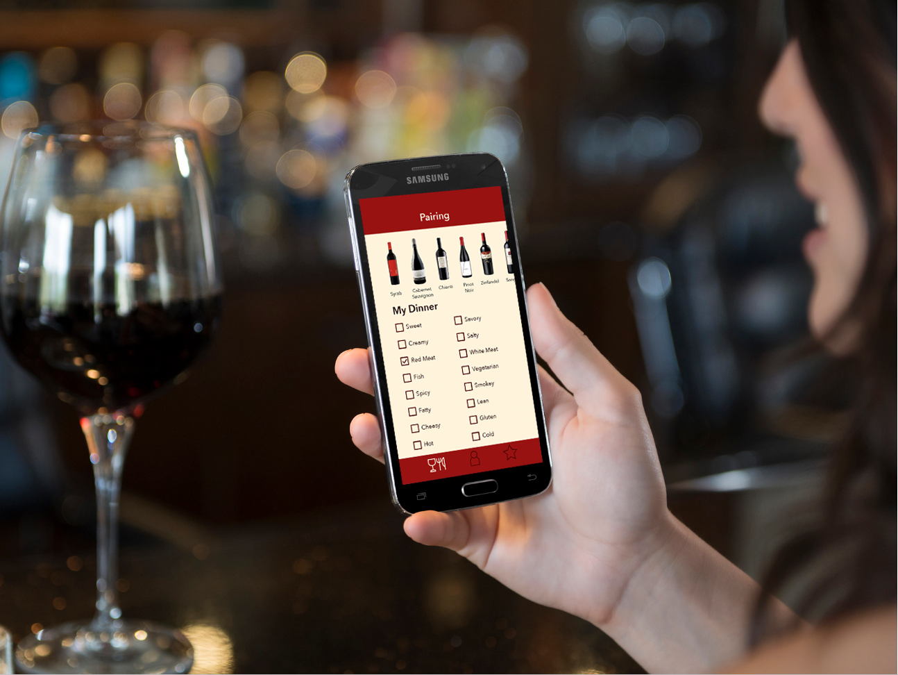
Food pairing screen
If the user were to click on the food pairing icon in the bottom left, they will move to a screen where they can select the distinguishing features of the food that they would like to pair with a wine. As choices are made, the dynamic scrollable list at the top reduces down, and the user can tap any bottle of wine that intrigues them at any time to investigate further.
Wine types screen
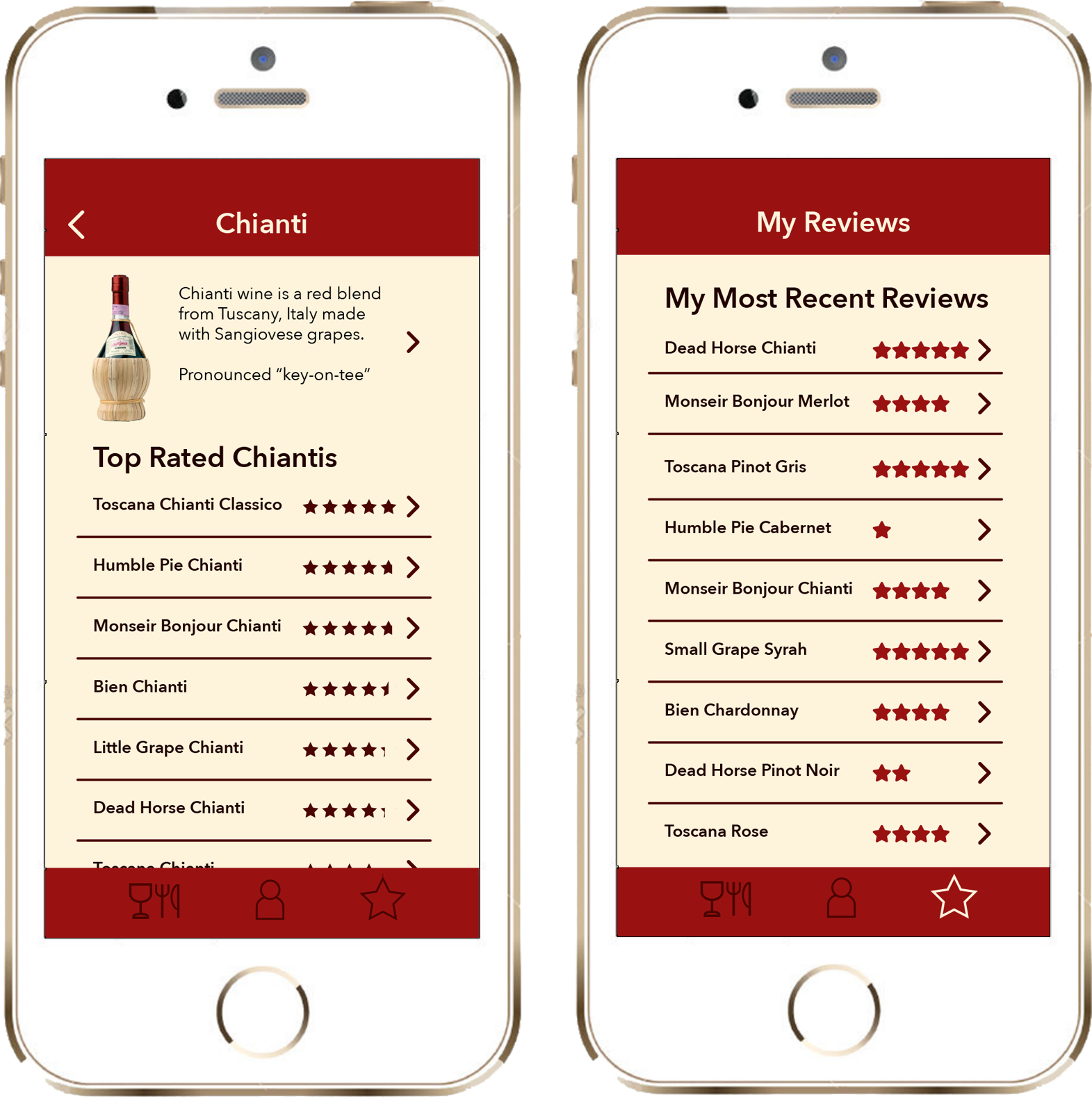
The user can learn more about wine types and explore highly rated examples of those wine types on the Wine Types screens.
My reviews
In the My Reviews section, the user can see a summary of all of the wines they have reviewed.
My process
Investigation
Starting with a theory, we started with research, to determine exactly what the novice wine drinker wants and needs in a wine app. Our initial theory was that the user would want help with developing their palate, and with logging. Turns out we were wrong. Based on triangulating secondary research, surveys, and interviews with wine experts and novice wine drinkers, we discovered that what users want is something to recommend wines based on their personal likes and dislikes. They want to help choosing wines in their price range both in the store, and in restaurants. We were surprised by some of the findings, and adjusted our vision to accommodate the newly discovered user needs.
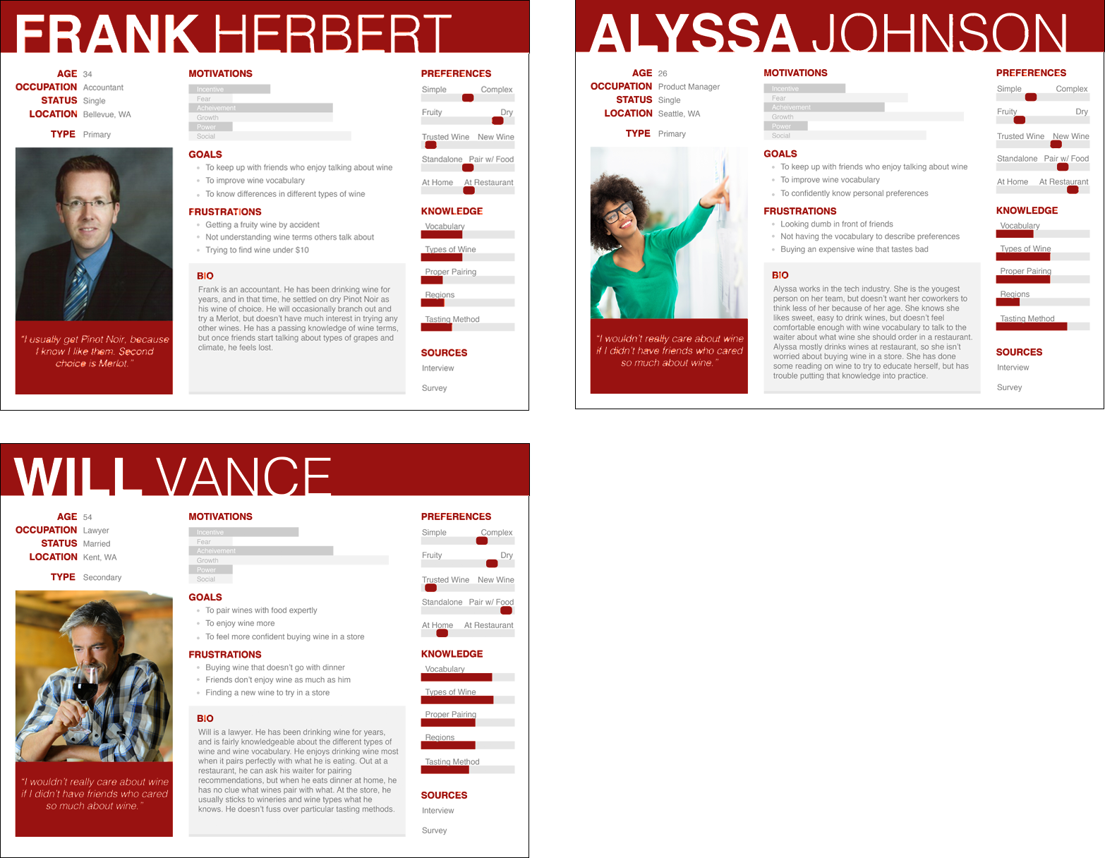
Personas
Patterns of needs were uncovered by triangulating the research methods. We used those themes to create the three personas shown above.
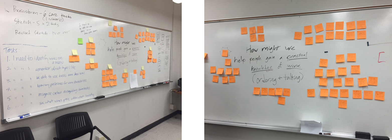
Brainstorming
Sticky note fun! Core tasks and user scenarios were also created from the results of the research and personas. We brainstormed how to help our personas achieve those goals. From this brainstorming, a clear information architecture was formed.
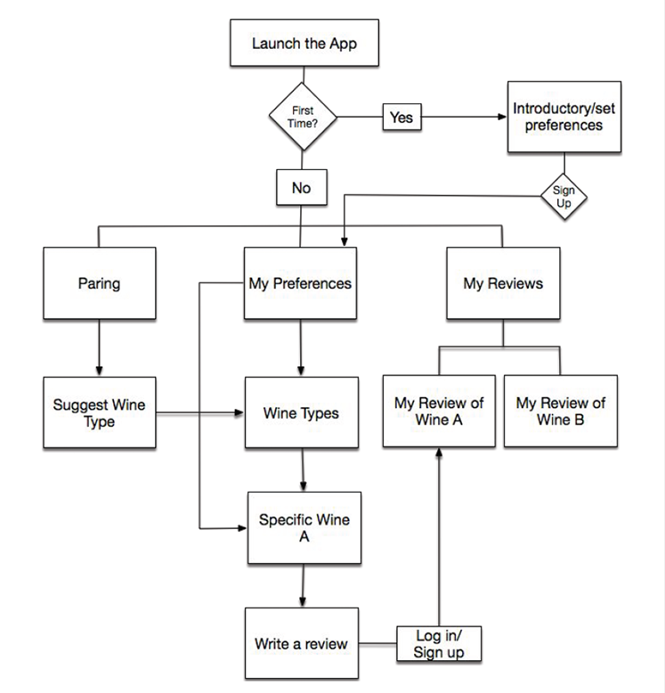
User flow
Then a user flow was created to test the success of our scenarios and tasks.
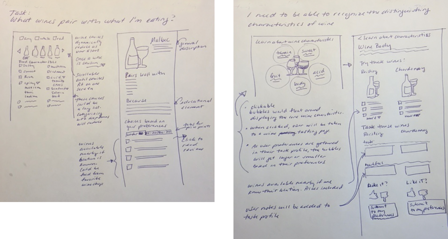
Sketching
Next was time to start sketching the screens. From the sketches, wireframes were created, then the final design as shown at the top of the page.
Usability
I created a marginally functional prototype using Marvel. I then usability tested the app with users. All users were given the same tasks that allowed them to interact with all of the pages of the app. As always, it was humbling. A prioritized list of changes were created to address issues with searching, understanding the My Preferences screen, giving good feedback that a review had been completed. Changes were made, and the iteration process was begun.
My Role:
User research
Design
Prototyping
Usability testing
The Problem:
People want help in deciding what wine to choose, and what would compliment their food. They need help translating their preferences into wine speak.
The Solution:
An app that helps with basic wine knowledge that learns your preferences then uses those preferences to predict which wines you would enjoy based on food pairings.