polling app

before and after of design
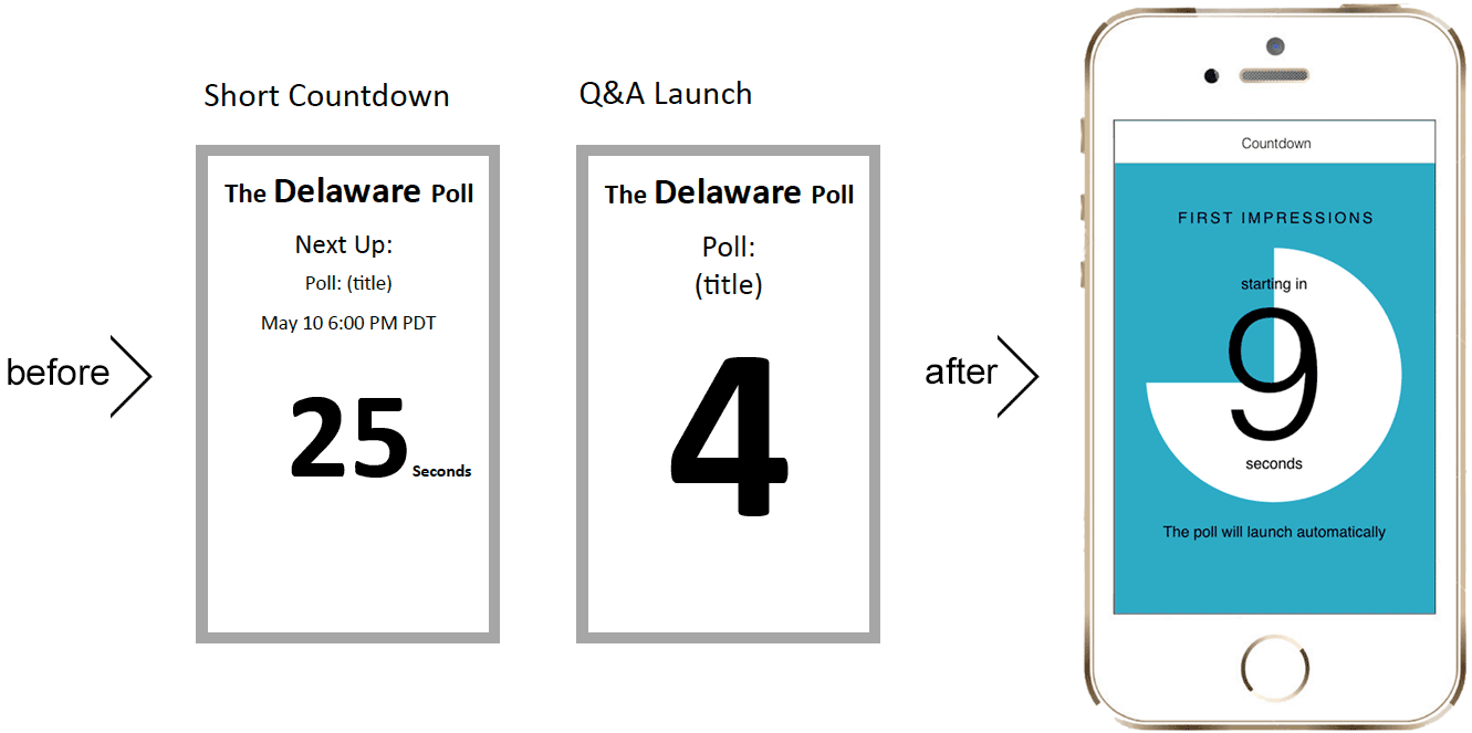
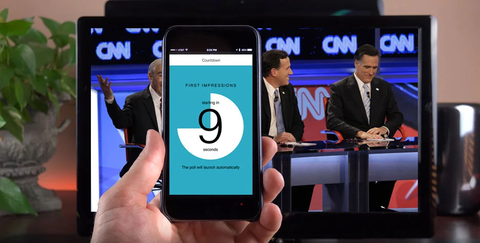
Countdown
The client presented me with screens of their concept, thinking they just wanted visual design. They had originally conceived the countdown to launch being two separate designs. After investigating all scenarios, I was able to convince them that along with another design feature to handle the distant future scenario, one flexibly designed screen was all that was necessary here. In the last minute while waiting for the poll to begin, the user will see this countdown animation, and will receive audio and vibration alerts in the last few seconds.
Quiz screen
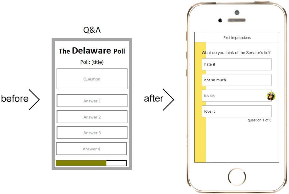
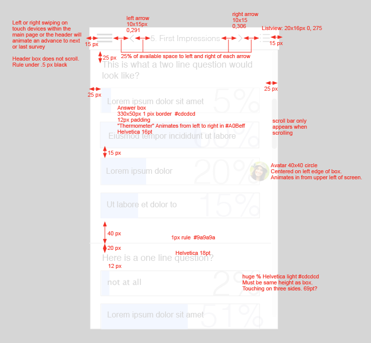
Each polling question has a limited time window in which it can be answered. In order to convey that visually to the user as simply as possible, without having more text on the screen, I designed the time remaining to be shown graphically with a color bar gradually filling the screen. This way the user could know how much time they have left without having to remove their eyes from the content.
Results
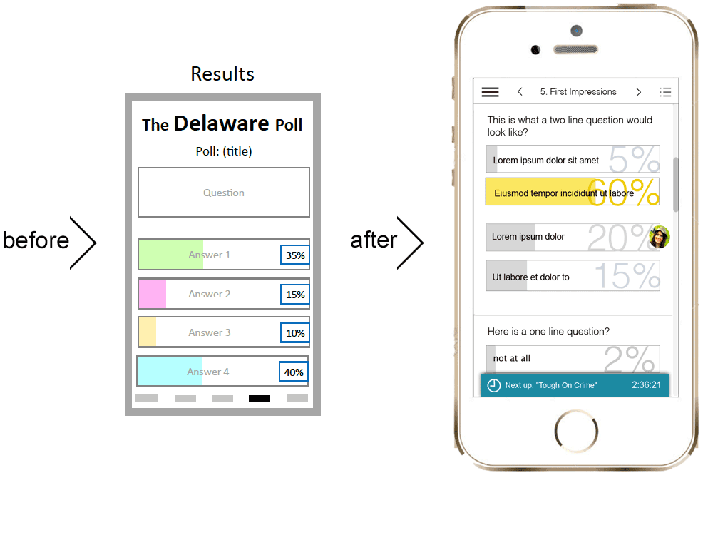
Once the poll is completed, the user is shown the results of the poll. By keeping the same format as the quiz they just took, I was adhering to the heuristics of consistency and recognition to aid the user in grokking what they are seeing.
The winner of the poll is shown in color, while that which the user chose is indicated by their avatar being displayed next to that choice. All results are shown visually with the bar filled in the percentage of the popularity of that choice, and numerically with a the large percentage. With this solution, I was able to convey a lot of information in a simple visual.
Past results are available through the navigation.
The administrator of the poll has the capacity to send messages to the user via what we named "toast" that pops up, and can be dismissed.
Past Polls
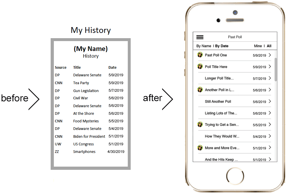
If the user wants to review past polls, research showed that they wanted to be able to filter by name, date, and whether they have participated in the poll or not. By adding some simple navigation I was able to give the user a more useful and robust experience.
My Process
Investigation
For research, I was only able to interview the clients about the end user and the different types of clients that would be the purchasers of their product. I was the first designer to enter this space. It was a fabulously fun challenge to bring their thinking around to how the end user would be approaching, and interacting with the app, and how the product would need to change as a result.
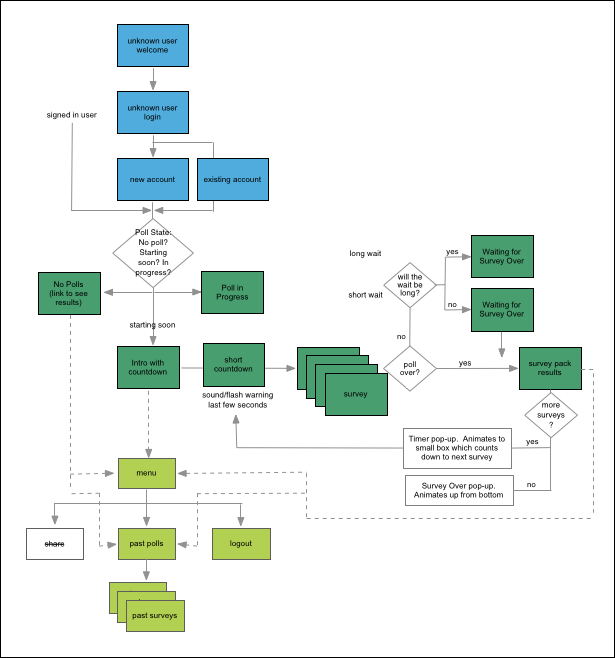
User Flow
When I started fleshing out the user flow, it became clear that the app was actually much more complicated than the client had first thought. I worked with them over a few iterations of this flow to work out what the ideal user flow would be.
Seeing this flow was immensely useful for the developer to get an overall perspective and visual that he hadn't had before. As always, time was of the essence, so once getting this nailed down we were able to prioritize, and move much more quickly having this central point of understanding.
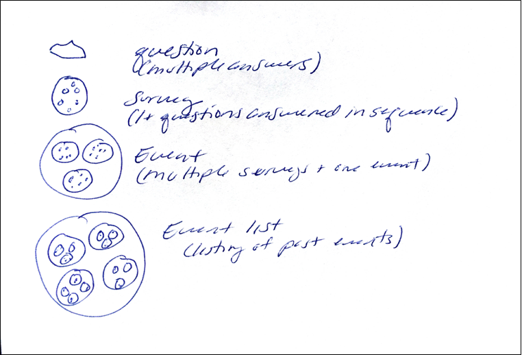
Sketching
As more evidence of the app being more complicated than the client was aware, while designing the archive section, the client and I kept getting confused over the names for the different layers of content, and how the user would need or want to access it. As a visual thinker, I did this little sketch to help me understand the layers, and to give us a common lexicon of what each layer would be called, so we could be on the same page. Food metaphors rarely fail. Each question was like a chocolate chip. A survey was a chocolate chip cookie. An event was a plate of chocolate chip cookies, and an event list was like a bake sale of different plates of cookies. This mutual understanding helped me to design the archive section.
User Testing
Other than some "hallway usability" I did on friends, the user testing is to be the proof of concept testing with live users, and live data on a small scale, which to date has not been done. Some contractual complications have tied that up.
Redlines
Communicating a design with the developer as they want to receive the information is something I have been complimented on many times. I pride myself in delivering all of the information the developers wants in exactly the way they want to receive it. This makes their job faster and easier, and more importantly, with less misinterpretation, and need for bug fixing.
My Role:
Information architecture
Page flows
UX design
Wireframing
Interaction design
Visual design
Redline
The Problem:
For this polling app, my first challenge was to convey some complicated results in a visually simple way. My second challenge was to design it to be visually neutral to facilitate third party branding.
The Solution:
To solve the problem of the complicated results, I used layering of information, showing information in graphic instead of textual terms, and creating a comprehensive navigation scheme that would allow access to varying levels of detail. To achieve a visually neutral design, I kept to simple colors, and a clean uncluttered design that would be easily swapping out a CSS file.