Bodypoint wheelchair accessories website

My Process
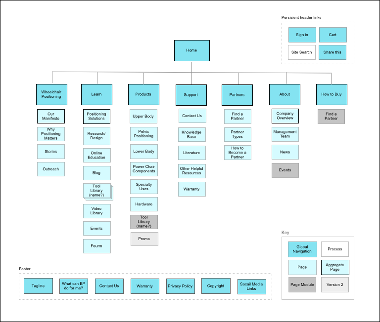
Information Architecture
I used customer interviews, site metrics, and customer service call data to create an information architecture that is a reflection of the customer's mental model.
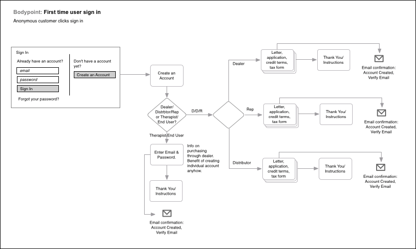
User Flows
Although user flows and scenarios are at times the places where some of the biggest issues are discovered, in this case, it went remarkably smoothly, both in creation, and when working it through with the client.
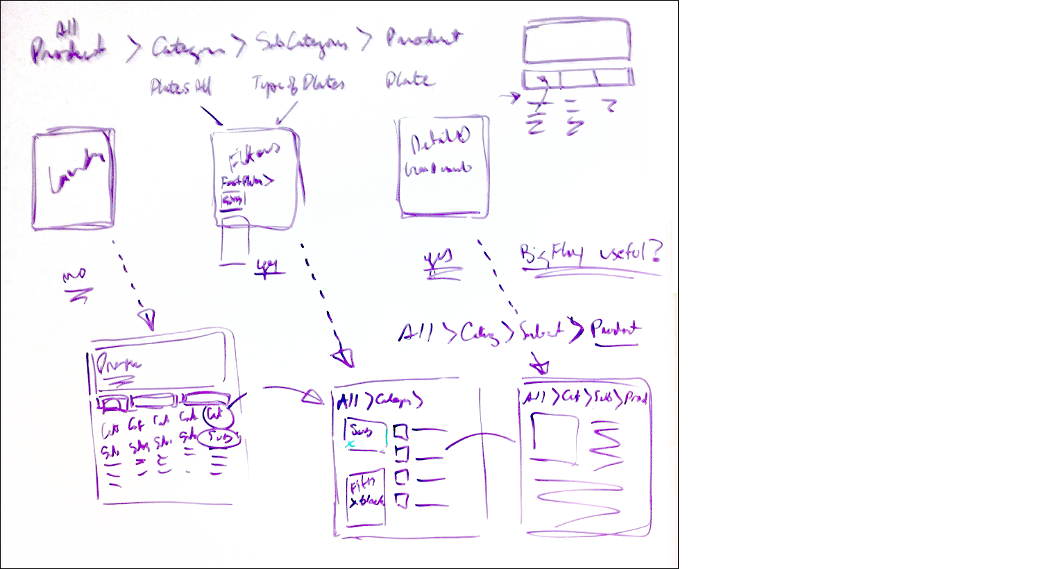
Wireframing whiteboarding
Whiteboard collaborating with other designers on all of the various complications, and user bases, was a great way to hash out all of the scenarios and user flows to provide each persona and use case the best possible user experience.
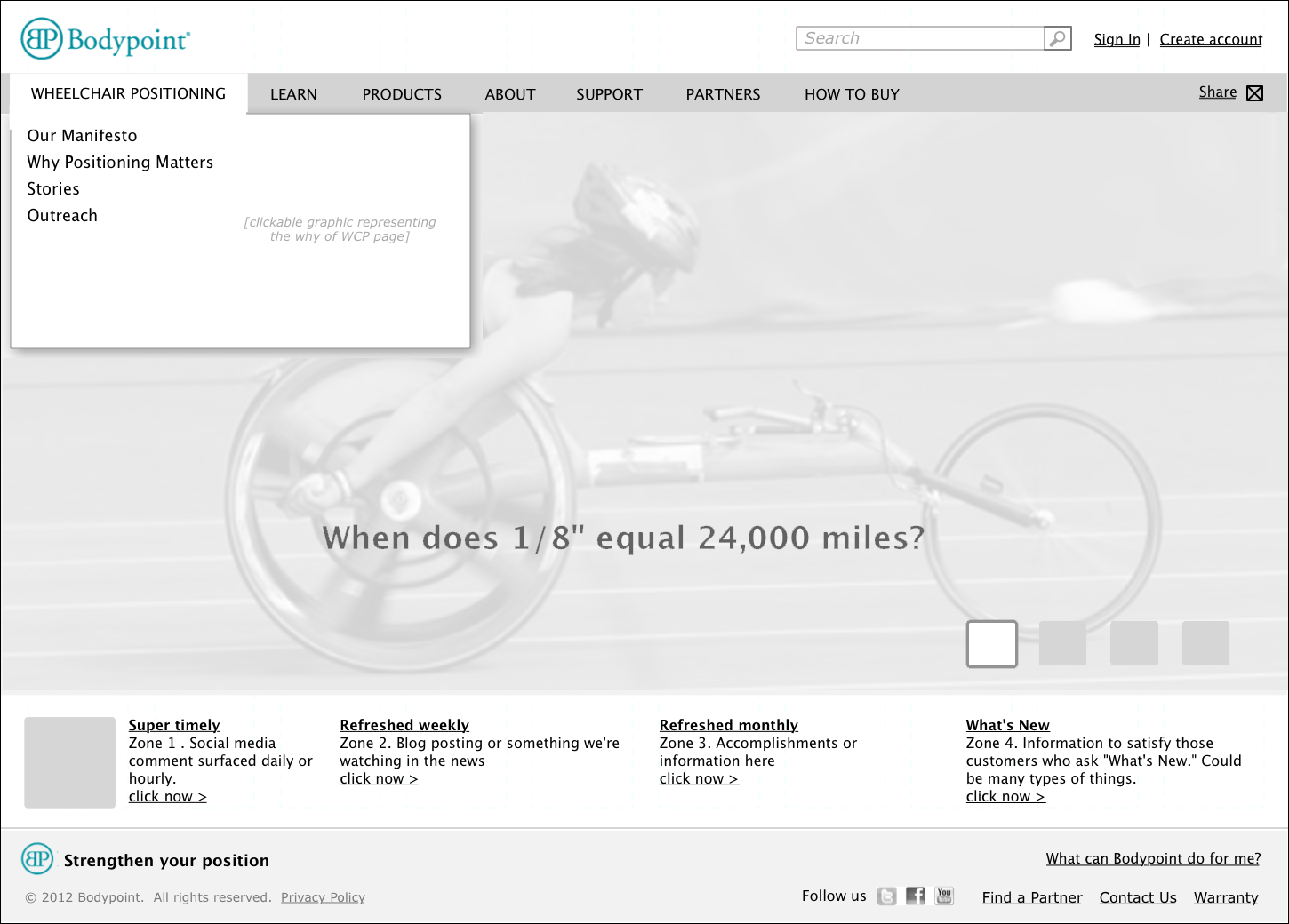
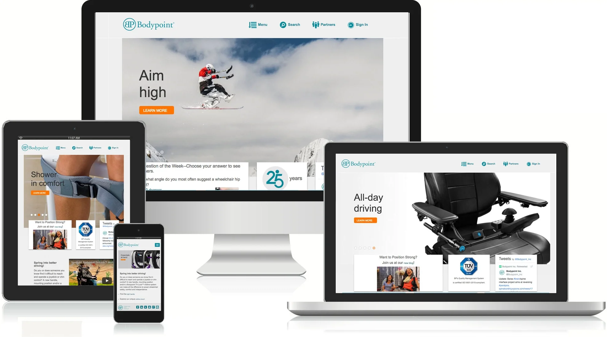
Wireframe homepage
I designed a home page design that would satisfy all of the needs that bubbled up during discovery. The power user needs direct access to the exact products they know they want. In addition to search to accomplish that, I used nested tabs and subtab navigation model to allow deep dives directly to the desired content globally from any page on the site. As a bonus, the tab and subtab navigation also allows any user a quick overview of all that the site has to offer.
To address issues with the brand, customer mental model, and SEO problems that bubbled up, I made other changes to the IA. To further establish the brand, I did three things. First, I created a large rotating hero image area of inspirational and empowering images. Second, I created a way to feature and highlight up to the minute news to keep the site fresh and current. And last, I created a new area to highlight stories emphasising their thought leadership while educating and informing the user.
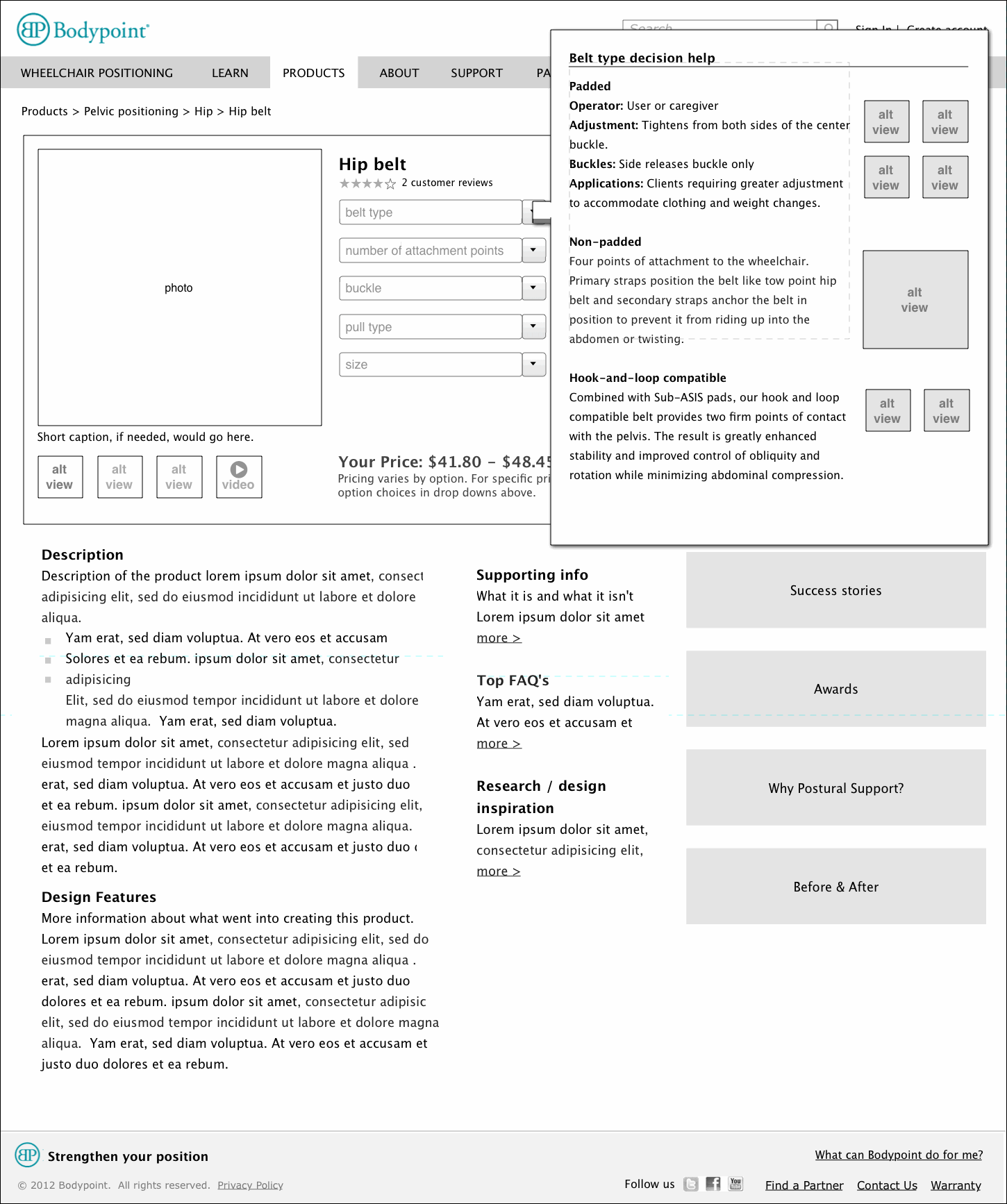
Wireframe product detail page
The product detail page was interesting and challenging to design. To solve the dual problems of customers ordering the wrong items and excessive calls to customer service, I needed to make sure users had all of the information they need at the right time. I worked closely with the client to provide a structure where the user would be walked through a wizard-style process. They were asked relevant questions in real time, then were provided with relevant information so the user would know exactly what to order, and what related parts would or wouldn't be helpful for a particular wheelchair occupant. None of this would interfere with the power user.
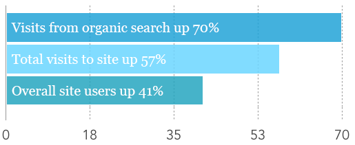
% Increases since redesign
My Role:
Information architecture
User flows
Wireframing
UX
The Problem:
There were five main goals of this site redesign. To bring their website into the 21st century, to establish their brand, to help customers find products and information more easily, to reduce customer service calls, and to allow them to manage updates in-house.
The Solution:
In order to reach those goals, I was brought in to do needfinding, IA, flows, and wireframing for the most important and most traveled portions of the site. The wire framing created a framework to establish the brand as a company that is a cutting edge thought leader. This was done with a homepage carousel of powerful images, navigational drop downs with featured areas, and quick update areas for Twitter feeds, or breaking news. The redesign resulted in:
- Visits from organic search up 70%
- Total visits to site up 57%
- Overall site users up 41%